Differential Gene Expression from Illumina RNAseq
21 May 2024Background
Differential expression analysis is a powerful tool in genomics. The goal is to detect transcripts that are present at different levels in different samples. Samples could be diseased versus healthy tissue, individuals treated with a drug versus controls, individuals from different populations, etc. The determination and subsequent analysis of genes that are differentially expressed can give insight into the biological processes affected by the disease/treatment/population, or whatever factor(s) are being used to contrast the samples.
The principle behind determining which genes are differentially expressed is similar to that for other hypothesis-based tests such as ANOVA or t-tests. We will call genes differentially expressed if the mean expression between treatments is larger than would be expected by chance given the amount of variance among replicates within a treatment type. However there are several important issues to consider: the first is multiple testing. Imagine doing a t-test for differential expression on 30,000 genes. At p < .05 you would expect 5% (1500!) of the genes to be called as significantly different by random chance. This is known as the multiple testing problem and the p-values must be adjusted to compensate for the large number of tests. Second there are typically very few replicates per treatment reducing power; thankfully techniques have been developed to “share” information between genes to somewhat deal with this issue. Third, the methods developed for microarray analysis are not directly applicable. Log-transformed microarray data can be effectively modeled as normally distributed. In contrast RNAseq data is count data and therefore has a different (non-normal) numerical distribution. Consequently statistical models require a different error distribution.
At first glance one might think that the Poisson distribution would be an appropriate model for RNAseq data: reads are discrete events and the chance of a read landing in any particular gene is very low. Indeed Poisson models were originally tried. However, in the Poisson distribution the expected mean and variance should be equal. For most RNAseq data this is not true; the data is over-dispersed: the variance is larger than the mean. Alternatives are the Negative Binomial and Quasi-Poisson models.
It is important to consider an appropriate measure of expression and normalization. Normalization is important: if you have a total of 10,000,000 reads from 1 sample and 5,000,000 reads from another sample clearly an adjustment for the total number of reads (a.k.a library size) must be done. While some favor RPKM (Reads per kilobase exon length per million reads mapped), for finding DE genes it is better to normalize counts between samples using a different method (discussed below) and to not adjust for gene length. Why? 1) the number of reads is not always a linear function of gene length. 2) dividing by gene length causes a loss of information. By RPKM a gene of 1kb with 10 counts would be treated the same as a 100bp gene with 1 count, but clearly we are much more confident of the expression level when we have 10 counts instead of 1. This information is lost in RPKM.
Regarding normalization between samples, genes with very high expression levels can skew RPKM type normalization. Consider two samples where gene expression is the same except that in the first sample RUBISCO is expressed at a very high level, taking up half of the reads. In the second sample RUBISCO is expressed at a lower level, accounting for 25% of the reads. By RPKM all non RUBISCO genes will appear to be expressed more highly in the second sample because RUBISO “takes up” fewer reads. Methods such as TMM normalization can account for this.
Two packages that effectively deal with the above issues are DESeq2 and edgeR, both available through Bioconductor. Both are recommend. We will use edgeR for today’s exercises.
If you are going to do your own RNAseq analyses at some later time, I strongly recommend that you thoroughly study the edgeR user manual available both at the link and by typing edgeRUsersGuide() in R (after you have loaded the library).
Lab work starts here
Set your working directory
Pull your Assignment_10 repository and set the appropriate working directory in R.
You can open the Assignment_10.Rmd file there to record you answers.
StringR and Regular Expressions.
Before we get going with the actual data we need to learn some new skills. The Stringr library provides useful tools for string manipulation in R. Regular expressions are a powerful syntax for matching wildcard patterns.
Exercise 0: I have written a tutorial to introduce stringr and regular expressions. Please do the tutorial. In addition to entering your answers on the tutorial website, cut and paste any code that your write from the tutorial into the Exercise 0 code chunk. Set eval=FALSE . They can all go in one code block.
If you didn’t watch the 3 minute regexplain video at the end of the tutorial do it now.
Install regexplain:
From the R console:
library(devtools)
install_github("gadenbuie/regexplain")
When asked about updating packages you can just press “Enter” to skip.
Restart Rstudio.
Bam to read counts
As you know from last week’s lab, we mapped RNAseq reads to the B. rapa genome. In order to ask if reads are differentially expressed between cultivars (IMB211 vs. R500) or treatments (dense planting vs. non-dense planting) we need to know how many reads were sequenced from each gene.
To do this we use the bam files (telling us where in the genome the reads mapped) and the .gff file that defines where the genes are. Then we need to count the number of reads mapping to each gene described in the .gff. Thankfully tools like htseq-count from the python package HTSeq do this for us. An alternative would be to use kallisto to map reads to cDNA fasta files and get the counts all in one step (this is actually a preferred option if you have a high-quality cDNA reference and don’t care about SNPs).
But for this lab we will use HTseq on the two files from Thursday.
Run HTseq-count
We will get the counts from the two files used for the SNP / VCF lab (last Thursday). Depending on where you put those files, you may (or may not) need to update the paths below. Since the counts will be used as input for the rest of today’s lab, we will run htseq-count from our Assignment 10 input directory so that the results are saved there.
The general format is htseq-counts [options] sam/bam_file1 [sam/bam_file2-N] .gff_file
cd ../input # assumes you are starting from your `scripts` directory

htseq-count -s no -t CDS -i Parent \
../../assignment-09-jnmaloof/output/STAR_out-IMB211_INTERNODE_A03/IMB211_INTERNODE_Aligned_A03.bam \
../../assignment-09-jnmaloof/output/STAR_out-R500_INTERNODE_A03/R500_INTERNODE_Aligned_A03.bam \
../../assignment-09-jnmaloof/input/Brapa_reference/Brapa_gene_v1.5.gff > A03_counts.tsv
Exercise 1 Let’s take a look at how well the mapping went.
a Read the help file for htseq-count. What do the -s -t and -i options do and why is it important that we change from the default value? Hint: take a look at the gff file to help answer why we changed -t and -i
b Use head or more to take a look at A03_counts.tsv. What do the three columns represent?
c Use samtools stats ../../assignment-09-jnmaloof/output/STAR_out-IMB211_INTERNODE_A03/IMB211_INTERNODE_Aligned_A03.bam | grep "reads mapped:" To find the total number of mapped reads in this file. Record the number here.
d Use tail on A03_counts.tsv. Calculate the % of IMB211 reads that were classified as “no_feature”, “ambiguous”, or “alignment_not_unique” (report three percentages). You do not need to show code, just give the percentages.
e Explain what “no_feature”, “ambiguous” and “alignment_not_unique” mean.
f Why might there be reads that map to a location with no feature?
Finding differentially expressed genes with edgeR
The steps for finding differentially expressed genes are to:
- Load the RNAseq counts.
- Normalize the counts.
- QC the counts.
- Create a data frame that describes the experiment.
- Determine the dispersion parameter (how over-dispersed is the data?)
- Fit a statistical model for gene expression as a function of experimental parameters.
- Test the significance of experimental parameters for explaining gene expression.
- Examine results
Get the counts data
We want to look at more than the genes on A03. I have mapped the full data set and calculated counts for you. Download it with:
download.file("https://bis180ldata.s3.amazonaws.com/downloads/Illumina_Assignment/gh_internode_counts2.tsv", "../input/gh_internode_counts2.tsv")
We will study gene expression levels in Brassica rapa internodes grown under two treatments, Dense Planting (DP) and Not Dense Planting (NDP). We will study the response to DP in two cultivars, IMB211 and R500. This data set has 12 samples with counts of 40991 genes. This is the data that would have been generated by running STAR and htseq-count on all 12 BAM files mapped to all chromosomes. (Full disclosure, these counts were actually generated with the older program tophat, but the procedures below will be the same)
Exercise 2
a. Create a new object in R called counts.data with the internode data. (Use read_tsv() to import)
b. Check to make sure that the data looks as expected. (What do you expect and how do you confirm? Show your commands and output.)
You may have noticed that the first gene_id is labelled “*”. These are the reads that did not map to a gene. Let’s remove this row from the data. Also let’s replace any “NA” records with “0” because that is what NA means in this case
counts.data <- counts.data %>% filter(gene_id!="*")
counts.data[is.na(counts.data)] <- 0
Exercise 3
The column names are too long. Use the str_remove() (or str_replace()) command to remove the “.1_matched.merged.fq.bam” suffix from each column name. Although it doesn’t matter in this case, surrounding the “pattern” inside of the function fixed() would be a good idea, because “.” is a wildcard character.
Hint: Here are two suggestions on how to change column names. First, using base R function colnames
data(iris) # get example dataset
colnames(iris) # original colnames
colnames(iris) <- str_replace(colnames(iris), fixed("."), "_")
colnames(iris) # it worked
Alternatively, you can use the tidyverse function rename_with to change the column names. For example, if I wanted to change the “.” to a “_” in the Iris data set:
data(iris) # get example data set
?rename_with # read about the relevant function

colnames(iris) # see current names
iris <- iris %>%
  rename_with(~ str_replace(., fixed("."), "_")) # use the str_replace function on all column names
colnames(iris) #it worked
When you are done, then typing colnames(counts.data) should give results below
##  [1] "gene_id"                "IMB211_DP_1_INTERNODE"  "IMB211_DP_2_INTERNODE"  "IMB211_DP_3_INTERNODE"
##  [5] "IMB211_NDP_1_INTERNODE" "IMB211_NDP_2_INTERNODE" "IMB211_NDP_3_INTERNODE" "R500_DP_1_INTERNODE"
##  [9] "R500_DP_2_INTERNODE"    "R500_DP_3_INTERNODE"    "R500_NDP_1_INTERNODE"   "R500_NDP_2_INTERNODE"
## [13] "R500_NDP_3_INTERNODE"
Data exploration
Exercise 4
a. Make a histogram of counts for each of the samples.
b. Is the data normally distributed? Make a new set of histograms after applying an appropriate transformation if needed.
Hint 1: You probably need to use pivot_longer() to change the data into long format. See the Rice SNP lab and pivot tutorial if you need a review.
Hint 2: You can transform the axes in ggplot by adding scale_x_log10() or scale_x_sqrt() to the plot. One of these should be sufficient if you need to transform, but for other ideas see the Cookbook for R page.
For our subsequent analyses we want to reduce the data set to only those genes with some expression. In this case we will retain genes with > 10 reads in >= 3 samples
DO NOT SKIP THIS STEP
counts.data <- counts.data[rowSums(counts.data[,-1] > 10) >= 3,]
Exercise 5A:
We expect that read counts, especially from biological replicates, will be highly correlated. Check to see if this is the case using the pairs() function and the cor() function. (This question is continued below)
)
Important Hint: pairs is slow on the full dataset. Try it on the first 1,000 genes. Do you need to transform to make the pairs output more meaningful?
Important Hint2: it will be hard to see the pairs plot in the Rstudio inline display. Once you have the plot, click the expand to full window icon to display the plot in its own window. **Alternatively, instead of using all columns of data, try it on a smaller number of columns **
Hint 3: remember that you will need to remove the “gene_id” column before using the data in pairs or cor
Exercise 5B:
Once you have a correlation table, use the function below to visualize it. Then, comment on the results from the pairs and correlation heatmap plots. Are the replicates more similar to each other than they are to other samples? Do you think there are any mistakes in the sample treatment labels?
rownames(cor.table) <- str_remove(rownames(cor.table), "_INTERNODE.*") #shorter names for better plotting
colnames(cor.table) <- str_remove(colnames(cor.table), "_INTERNODE.*")

cor.table %>% gplots::heatmap.2(dendrogram="row", trace = "none", col=viridis::viridis(25, begin=.25), margins=c(7,8))
Data normalization
In this section, we will normalize the counts data and determine how normalization influences the overall distribution of gene expression data. Data normalization is used in the analysis of differential gene expression using statistical models to account for differences in sequencing depth between samples, differences in the distribution of counts between different samples, and (sometimes) differences in the lengths of genes across the genome. Two commonly performed normalization methods used to analyze RNA seq data are RPKM (Reads per Kilobase per Million) and TMM (Trimmed Mean of M Values). We will use TMM in lab since TMM normalization is required for edgeR, and because RPKM is poorly behaved statistically. Normalized and non-normalized data will be visualized using box plots.
Assign Groups
Before we can normalize the data we need to be able to tell edgeR which groups the samples belong to. Here group refers to the distinct sample types (i.e. combinations of genotype and treatment), not considering biorep. In a later step we will need to tell edgeR our experimental design (the treatment and genotype relevant for each sample). We need create a data.frame with both group, genotype, and treatment info. We will use regular expressions to help us.
First create a tibble with the column names from the counts table.
sample.description <- tibble(sample=colnames(counts.data)[-1])
Exercise 6: Next use regular expressions, mutate, and the commands you learned in the stringr tutorial to create three new columns:
- column “gt” that has either IMB211 or R500, indicating the genotype
- column “trt” that indicates the treatment with either “NDP” or “DP”
- column “group” that has gt and trt pasted together with “_” as a separator. You can use
str_c()and the “gt” and “trt” columns for this.
When you are done your table should look like this:
## # A tibble: 12 × 4
##    sample                 gt     trt   group
##    <chr>                  <chr>  <chr> <chr>
##  1 IMB211_DP_1_INTERNODE  IMB211 DP    IMB211_DP
##  2 IMB211_DP_2_INTERNODE  IMB211 DP    IMB211_DP
##  3 IMB211_DP_3_INTERNODE  IMB211 DP    IMB211_DP
##  4 IMB211_NDP_1_INTERNODE IMB211 NDP   IMB211_NDP
##  5 IMB211_NDP_2_INTERNODE IMB211 NDP   IMB211_NDP
##  6 IMB211_NDP_3_INTERNODE IMB211 NDP   IMB211_NDP
##  7 R500_DP_1_INTERNODE    R500   DP    R500_DP
##  8 R500_DP_2_INTERNODE    R500   DP    R500_DP
##  9 R500_DP_3_INTERNODE    R500   DP    R500_DP
## 10 R500_NDP_1_INTERNODE   R500   NDP   R500_NDP
## 11 R500_NDP_2_INTERNODE   R500   NDP   R500_NDP
## 12 R500_NDP_3_INTERNODE   R500   NDP   R500_NDP
Finish up this data frame by running the code below to convert gt and trt to factors. This enables us to set “NDP” as the “baseline” treatment conditions.
sample.description <- sample.description %>%
  mutate(gt=factor(gt),
         trt=factor(trt,levels = c("NDP","DP"))) # setting the levels in this way makes "NDP" the reference

sample.description
Calculate normalization factors
Now we use the edgeR function calcNormFactors() to calculate the effective library size and normalization factors using the TMM method on our counts data. First we create a DGEList object, which is an object class defined by edgeR to hold the data for differential expression analysis. DGEList wants a numeric matrix as input, so need to convert our counts.data
library(edgeR)
counts.matrix <- counts.data %>% select(-gene_id) %>% as.matrix()
rownames(counts.matrix) <- counts.data$gene_id

dge.data <- DGEList(counts=counts.matrix,
                    group=sample.description$group)
dim(dge.data)
dge.data <- calcNormFactors(dge.data, method = "TMM")
dge.data$samples # look at the normalization factors
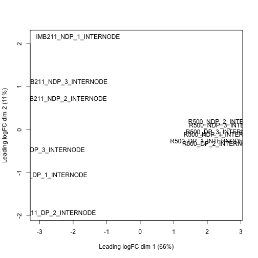
Make a MDS plot to show overall similarity / differences in gene expression.
Similar to the SNP data set from the Rice lab, we have a high dimension data set. Also like the SNP data set we can use multi-dimensional scaling to plot each samples similarity or distance in gene expresion space.
plotMDS(dge.data)
 If desired, we can make a nicer plot using ggplot:
mdsvals <- plotMDS(dge.data, plot = FALSE) # get the MDS values for plotting

tibble(x=mdsvals$x, y=mdsvals$y, sample=rownames(dge.data$samples)) %>%
  inner_join(sample.description) %>%
  ggplot(aes(x=x, y=y, color=trt, shape=gt)) +
  geom_point(size=3)
## Joining with `by = join_by(sample)`
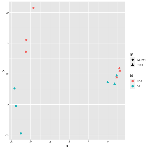
Exercise 7
Discuss the MDS plot. What do the x- and y-axes separate? Does this plot give you confidence in the experiment or cause concern?
Exercise 8
We can extract the normalized data with:
counts.data.normal <- cpm(dge.data)

# or log2 transformed:
counts.data.normal.log <- cpm(dge.data,log = TRUE)
To get a graphical idea for what the normalization does, make box plots of the log2 count data for each sample before and after normalization. Discuss the effect of normalization.
Hint 1: You will need to log2 transform the raw counts before plotting. Add a value of “1” before log2 transforming to avoid having to take the log2 of 0. Your transformation will look something like this:
counts.data.log <- log2(counts.data[,-1] + 1)
Hint 2: If you don’t want to bother with pivot_longer before going to ggplot, you can just use the boxplot() function and feed it the (transformed) matrix directly.
Hint 3: Why do I use [,-1] above? Do you need to use this on counts.data.normal.log?
Calculate dispersion factors
Dispersion, or spread of the data, describes how “squeezed” or “broad” a distribution is. In a negative binomial distribution (as is used for sequence count data), the BCV is the square root of the dispersion of the negative binomial distribution. You will calculate the tagwise dispersion in this section. The use of this tagwise (or gene-specific) dispersion is necessary to allow genes whose expression is consistent between replicates to be ranked more highly than genes that are not.
EdgeR offers 3 ways to calculate dispersion: Common, Trended, and Tagwise. To calculate dispersion, we need to set up a model of our experiment (aka the Design). The output plot graphs the Biological Coefficient of Variation (BCV) on the y-axis, relative to gene expression level on the x-axis. Each type of dispersion value is indicated on the plotBCV() graph. An empirical Bayes strategy is used to squeeze the dispersion of all genes toward the common dispersion.
First we tell edgeR about our full experimental design.
design <- model.matrix(~gt+trt,data = sample.description)
rownames(design) <- sample.description$sample
design
##                        (Intercept) gtR500 trtDP
## IMB211_DP_1_INTERNODE            1      0     1
## IMB211_DP_2_INTERNODE            1      0     1
## IMB211_DP_3_INTERNODE            1      0     1
## IMB211_NDP_1_INTERNODE           1      0     0
## IMB211_NDP_2_INTERNODE           1      0     0
## IMB211_NDP_3_INTERNODE           1      0     0
## R500_DP_1_INTERNODE              1      1     1
## R500_DP_2_INTERNODE              1      1     1
## R500_DP_3_INTERNODE              1      1     1
## R500_NDP_1_INTERNODE             1      1     0
## R500_NDP_2_INTERNODE             1      1     0
## R500_NDP_3_INTERNODE             1      1     0
## attr(,"assign")
## [1] 0 1 2
## attr(,"contrasts")
## attr(,"contrasts")$gt
## [1] "contr.treatment"
##
## attr(,"contrasts")$trt
## [1] "contr.treatment"
This has created a design matrix where each row represents one sample and each column represents a factor in the experiment. The “1”s indicate that a particular factor applies to a sample. In this design we have a coefficient to indicate the genotype and a coefficient to indicate the treatment.
Now we estimate the dispersions
#First the overall dispersion
dge.data <- estimateGLMCommonDisp(dge.data,design,verbose = TRUE)

#Then a trended dispersion based on count level
dge.data <- estimateGLMTrendedDisp(dge.data,design)

#And lastly we calculate the gene-wise dispersion, using the prior estimates to "squeeze" the dispersion towards the common dispersion.
dge.data <- estimateGLMTagwiseDisp(dge.data,design)

#We can examine this with a plot
plotBCV(dge.data)
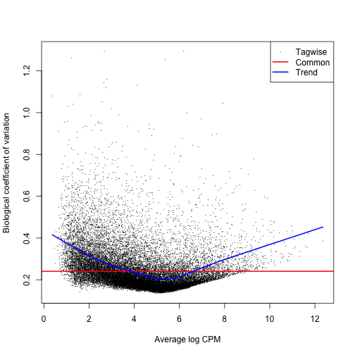
You can see from the plot why you would not want to rely on the common dispersion!
Find differentially expressed genes
Finally we are ready to look for differentially expressed genes. We proceed by fitting a generalized linear model (GLM) for each gene.
fit <- glmFit(dge.data, design)
The model fit above is the “full” model, including coefficients for genotype and treatment. To look for differentially expressed genes we compare the full model to a reduced model with fewer coefficients. For example we could compare the full model to a model that removed the “genotype” term. For genes where the simpler model fits as well as the full model we can conclude that the dropped term was not important. Conversely, for genes fit significantly better by the full model we conclude that “genotype” was important. The function to do this is glmLRT() which performs a likelihood ratio test between full and reduced model.
To find genes that are differentially expressed in R500 vs IMB211 we use
gt.lrt <- glmLRT(fit,coef = "gtR500")
The differentially expressed genes can be viewed with topTags()
topTags(gt.lrt) # the top 10 most differentially expressed genes
## Coefficient:  gtR500
##                logFC   logCPM       LR        PValue           FDR
## Bra033098 -12.153105 6.070823 998.8287 3.227529e-219 7.757044e-215
## Bra023495 -11.889171 5.792298 974.5074 6.244524e-214 7.504044e-210
## Bra016271 -14.250692 8.144467 891.3678 7.385331e-196 5.916635e-192
## Bra020631 -11.318315 5.206858 870.7722 2.216733e-191 1.331924e-187
## Bra011216 -11.258770 5.133650 853.8519 1.057202e-187 5.081758e-184
## Bra020643 -14.383988 8.280736 841.0551 6.400444e-185 2.563805e-181
## Bra009785   7.950946 6.018503 786.8299 3.940098e-173 1.352805e-169
## Bra011765  -7.319947 6.341553 749.4442 5.299626e-165 1.592140e-161
## Bra026924  -8.334013 5.028260 729.9894 9.005266e-161 2.404806e-157
## Bra029392   8.339064 6.296476 723.1410 2.777574e-159 6.675622e-156
In the resulting table,
- logFC is the log2 fold-change in expression between R500 and IMB211. So a logFC of 2 indicates that the gene is expressed 4 times higher in R500; a logFC of -3 indicates that it is 8 times lower in R500.
- logCPM is the average expression across all samples.
- LR is the likelihood ratio: L(Full model) / L(small model) .
- PValue: unadjusted p-value
- FDR: False discovery rate (p-value adjusted for multiple testing…this is the one to use)
To summarize the number of differentially expressed genes we can use decideTestsDGE()
summary(decideTestsDGE(gt.lrt,p.value=0.01)) #This uses the FDR. 0.05 would be OK also.
##        gtR500
## Down     5487
## NotSig  13562
## Up       4985
In this table, the Down row is the number of down regulated genes in R500 relative to IMB211 and the Up row is the number of up regulated genes.
If we want to create a table of all differentially expressed genes at a given FDR, then:
#Extract genes with a FDR < 0.01 (could also use 0.05)
DEgene.gt <- topTags(gt.lrt,n = Inf,p.value = 0.01)$table

#save to a file
write.csv(DEgene.gt,"../output/DEgenes.gt.csv")

#Or if we want all genes, regardless of FDR:
DEgene.gt.all <- topTags(gt.lrt,n = Inf, p.value = 1)$table
#save to a file
write.csv(DEgene.gt.all,"../output/DEgenes.gt.all.csv")
It would be handy to plot bar charts of genes of interest. Below is a function to do that. Once the function is entered and sourced, we can use it to plot gene expression values.
plotDE <- function(genes, dge, sample.description) {
  require(ggplot2)
  tmp.data <- t(log2(cpm(dge[genes,])+1))
  tmp.data <- tmp.data %>%
    as.data.frame() %>%
    rownames_to_column("sample") %>%
    left_join(sample.description,by="sample")
  tmp.data <- tmp.data %>%
    pivot_longer(cols=starts_with("Bra"), values_to = "log2_cpm", names_to = "gene")
  pl <- ggplot(tmp.data,aes(x=gt,y=log2_cpm,fill=trt))
  pl <- pl + facet_wrap( ~ gene)
  pl <- pl + ylab("log2(cpm)") + xlab("genotype")
  pl <- pl + geom_boxplot()
  pl + theme(axis.text.x  = element_text(angle=45, vjust=1,hjust=1))
}
With the function defined we can call it as follows:
# A single gene
plotDE("Bra009785",dge.data,sample.description)

#top 9 genes
plotDE(rownames(DEgene.gt)[1:9],dge.data,sample.description)
Exercise 9
a. Find all genes differentially expressed in response to the DP treatment (at a FDR < 0.01).
b. How many genes are differentially expressed?
c. Make a plot of the top 9
Gene by Treatment interaction
Examining the plots of the top gene regulated by treatment you will notice that several of the genes have a different response to treatment in IMB211 as compared to R500. We might be specifically interested in finding those genes. How could we find them? We look for genes whose expression values are fit significantly better by a model that includes a genotype X treatment term.
The new model can be constructed as follows:
design.interaction <- model.matrix(~gt*trt,data = sample.description)
rownames(design.interaction) <- sample.description$sample
design.interaction
##                        (Intercept) gtR500 trtDP gtR500:trtDP
## IMB211_DP_1_INTERNODE            1      0     1            0
## IMB211_DP_2_INTERNODE            1      0     1            0
## IMB211_DP_3_INTERNODE            1      0     1            0
## IMB211_NDP_1_INTERNODE           1      0     0            0
## IMB211_NDP_2_INTERNODE           1      0     0            0
## IMB211_NDP_3_INTERNODE           1      0     0            0
## R500_DP_1_INTERNODE              1      1     1            1
## R500_DP_2_INTERNODE              1      1     1            1
## R500_DP_3_INTERNODE              1      1     1            1
## R500_NDP_1_INTERNODE             1      1     0            0
## R500_NDP_2_INTERNODE             1      1     0            0
## R500_NDP_3_INTERNODE             1      1     0            0
## attr(,"assign")
## [1] 0 1 2 3
## attr(,"contrasts")
## attr(,"contrasts")$gt
## [1] "contr.treatment"
##
## attr(,"contrasts")$trt
## [1] "contr.treatment"
Exercise 10:
a. Repeat the dispersion estimates and model fit but with the new design.interacion model. Show code.
b. How many genes show a significantly different response to treatment in IMB211 as compared to R500 (i.e. show a genotype by treatment interaction for expresson)? Save these genes to a file.
c. Make a plot of the top 9 genes that have a significantly different response to treatment in IMB211 as compared to R500.
Next steps
Now that we know which genes are differentially expressed by their ID, what follow up questions would we like to pursue?
- What types of genes are differentially expressed? This can be asked at the individual gene level and also at the group level
- What patterns of differential expression do we observe in our data?
- Are there any common promoter motifs among the differentially expressed genes? Such motifs could allow us to form testable hypotheses about the transcription factors responsible for the differential expression.