Rice SNPs
18 Apr 2024Getting Started
- Find the link to create the Assignment 04 repository in the Assignments tab.
- Create and clone the repository into a new Rstudio Project
- Download the file RiceSNPData.tar.gz, move the file to your input directory, and inflate the tar-ball (see your notes from “Just Enough Unix” if you don’t remember how to do this.) . You may or may not need to create the
inputfolder. - Open the
Assignment_4_template.Rmdfile and use that for your answers
Preliminaries
Let’s load the libraries we need:
library(tidyverse)
Some new tools
We begin by learning a few new tools to help us with the upcoming data sets. There will be a couple of more tutorials showing up later in this lab.
GGPlot
If you already know GGPLOT from BIS15L you can skip this
GGplot is a powerful graphing package for R and is part of the Tidyverse.
Learn some basics by doing my tutorial
More information on ggplot is available at
- R for Data Science Chapter 3
- Cookbook for R has many “how-tos” like how to change axis labels, etc.
- ggplot cheatsheet
Applying functions across rows or columns
It is very common to want to apply a function to each row. We can use the apply() function for this. apply takes at least 3 arguments.
apply(X,MARGIN,FUN)
where
- X is a data frame or matrix
- MARGIN is whether to apply a function to each row (1) or each column (2)
- FUN is the function that you want to use
For example
set.seed(430) # This command will make it so you get the same matrix
m <- matrix(round(rnorm(24),2),
            ncol=6,
            dimnames=list(NULL, LETTERS[1:6])) #create a matrix of numbers to illustrate apply
m
##          A     B     C     D     E     F
## [1,] -1.05  0.41  1.52 -0.47  0.41 -0.72
## [2,] -0.69 -0.87 -0.51  0.97  1.01  1.80
## [3,]  2.36  0.20 -0.32  0.81 -0.42 -0.47
## [4,]  0.93 -0.64 -0.08 -1.25  0.34  0.33
cat("\nrow minimums: ", apply(m,1,min)) # find the minimum value of each row
##
## row minimums:  -1.05 -0.87 -0.47 -1.25
PRACTICE (not graded) find the mean of each column of m using apply
Alternatives
For some key functions there are pre-defined convenience functions
rowMeans(m)
colMeans(m)
rowSums(m)
colSums(m)
Tidyverse Alternatives
To summarize all columns in the tidyverse way, use across(), which by default applies a function to each column.
m %>% as_tibble() %>%
  summarize(across(.cols=everything(),.fns = mean))
## # A tibble: 1 × 6
##       A      B     C      D     E     F
##   <dbl>  <dbl> <dbl>  <dbl> <dbl> <dbl>
## 1 0.387 -0.225 0.152 0.0150 0.335 0.235
Tidyverse row summaries are more cumbersome, but if you want to do it, first specify that you want to be operating on each row by rowwise() and then use mutate() to create a new column with the row means. The c_across() function combines each column specified (all columns by default) into a vector.
m %>% as_tibble() %>%
  rowwise() %>%
  mutate(rowmean = mean(c_across(cols=everything())))
## # A tibble: 4 × 7
## # Rowwise:
##       A     B     C     D     E     F rowmean
##   <dbl> <dbl> <dbl> <dbl> <dbl> <dbl>   <dbl>
## 1 -1.05  0.41  1.52 -0.47  0.41 -0.72  0.0167
## 2 -0.69 -0.87 -0.51  0.97  1.01  1.8   0.285
## 3  2.36  0.2  -0.32  0.81 -0.42 -0.47  0.36
## 4  0.93 -0.64 -0.08 -1.25  0.34  0.33 -0.0617
Lets get started with the real data
Data Import
You learned how to import data last week using read_csv(). Note that read_csv can read in a .gzipped file directly. Today we will provide an additional argument to the read_csv function:
OK TO CUT AND PASTE
Sys.setenv(VROOM_CONNECTION_SIZE="500000") # needed because the lines in this file are _extremely_long.
data.geno <- read_csv("../input/Rice_44K_genotypes.csv.gz",
                      na=c("NA","00")) #this tells R that missing data is denoted as "NA" or "00"
## New names:
## Rows: 413 Columns: 36902
## ── Column specification
## ───────────────────────────────────────────────────────────────────────────────── Delimiter: "," chr
## (36902): ...1, 1_13147, 1_73192, 1_74969, 1_75852, 1_75953, 1_91016, 1_146625, 1_149005, 1_149754...
## ℹ Use `spec()` to retrieve the full column specification for this data. ℹ Specify the column types or
## set `show_col_types = FALSE` to quiet this message.
## • `` -> `...1`
## • `6_17160794` -> `6_17160794...22252`
## • `6_17160794` -> `6_17160794...22253`
Use dim() to determine the numbers of rows and columns. (You can also look at the info in the right-hand pane). There are 413 rows and 36,902 columns. Generally I recommend looking at files after they have been read in with the head() and summary() functions but here we must limit ourselves to looking at a subset of what we read in.
head(data.geno[,1:10]) #first six rows of first 10 columns
summary(data.geno[,1:10]) #summarizes the first 10 columns
In this file each row represents a different rice variety and each column a different SNP. The column ...1 gives the ID of each variety. ...1 is not a very informative name (that column did not have a name in the data file and R assigned it the name ...1.) Let’s rename it:
data.geno <- data.geno %>% rename(ID=...1)

head(data.geno[,1:10]) #first six rows of first 10 columns
## # A tibble: 6 × 10
##   ID     `1_13147` `1_73192` `1_74969` `1_75852` `1_75953` `1_91016` `1_146625` `1_149005` `1_149754`
##   <chr>  <chr>     <chr>     <chr>     <chr>     <chr>     <chr>     <chr>      <chr>      <chr>
## 1 NSFTV1 TT        TT        CC        GG        TT        AA        CC         TT         AA
## 2 NSFTV3 CC        CC        CC        AA        GG        <NA>      CC         GG         TT
## 3 NSFTV4 CC        CC        CC        AA        GG        GG        CC         GG         TT
## 4 NSFTV5 CC        CC        TT        GG        GG        AA        TT         GG         TT
## 5 NSFTV6 CC        CC        CC        AA        GG        GG        CC         GG         TT
## 6 NSFTV7 TT        TT        CC        GG        TT        AA        CC         TT         AA
The column names give the chromosome and locations of each SNP. For example, “1_151492” is a SNP on chromosome 1, base position 151492.
A PCA Plot.
Principal Components Analysis (PCA) and Multi-Dimensional Scaling (MDS) plots can be used to display the genetic diversity in a 2D space. The full 36,901 SNPs take too long to run for this class so we will subset the data.
To do this we take advantage of the sample() function. Sample takes a random sample of the items it is given.
sample(x=1:10, # x is that we want to sample from
       size=5) # size is the number of samples we want to take from x
## [1] 2 6 7 9 1
# so the above takes 5 random samples from the numbers 1:10 (by default without replacement)
We can use this to randomly sample a data frame by rows or columns.
# first make a demo matrix
m2 <- matrix(1:100,nrow=10)
m2
##       [,1] [,2] [,3] [,4] [,5] [,6] [,7] [,8] [,9] [,10]
##  [1,]    1   11   21   31   41   51   61   71   81    91
##  [2,]    2   12   22   32   42   52   62   72   82    92
##  [3,]    3   13   23   33   43   53   63   73   83    93
##  [4,]    4   14   24   34   44   54   64   74   84    94
##  [5,]    5   15   25   35   45   55   65   75   85    95
##  [6,]    6   16   26   36   46   56   66   76   86    96
##  [7,]    7   17   27   37   47   57   67   77   87    97
##  [8,]    8   18   28   38   48   58   68   78   88    98
##  [9,]    9   19   29   39   49   59   69   79   89    99
## [10,]   10   20   30   40   50   60   70   80   90   100
If we want to randomly sample 3 rows, then:
m2[sample(1:nrow(m2),3),]
##      [,1] [,2] [,3] [,4] [,5] [,6] [,7] [,8] [,9] [,10]
## [1,]    6   16   26   36   46   56   66   76   86    96
## [2,]    2   12   22   32   42   52   62   72   82    92
## [3,]    3   13   23   33   43   53   63   73   83    93
Random number seeds
Computers generate psuedo-random numbers. Sometimes it is useful to have the computer generate the same set of “random” numbers for reproducibility. This is accomplished by setting the random number “seed” which determines the starting point for the random number generator. We will do this below so that we all are working with the same samples.
Exercise 1
Now, create a data subset that contains a random sample of 10000 SNPs from the full data set. Place the smaller data set in an object called data.geno.10000. Very important: you want to keep the first column, the one with the variety IDs, and you want it to be the first column in data.geno.10000. AND You do not want it to show up randomly later on in the data set. Think about how to achieve this. Hint: [ ] will help
Make the first line of you code block set.seed(0421)
Check the dimensions of your subset. If you don’t get the output below, you did something wrong:
dim(data.geno.10000)
## [1] 413 10001
Make sure that “ID” is in the first column and nowhere else (if not, you did something wrong)
colnames(data.geno.10000) %>% str_which("ID") #returns the position of entries that match "ID".
## [1] 1
End of Exercise 1
Now that we have our smaller subset we can create the PCA plot
First convert the genotype data to a numeric form.
#convert the data matrix to numbers
geno.numeric <- data.geno.10000[,-1] %>% # -1 to remove the first column, with names.
  lapply(factor) %>% # convert characters to "factors", where each category is internally represented as a number
  as.data.frame() %>% # reformat
  data.matrix() #  convert to numeric

head(geno.numeric[,1:10])
In order to calculate the principal components we need to get rid of NAs. A quick and dirty method is to replace the missing data with the average genotype for the SNP. More sophisticated would be to impute the genotype using linkage data and the neighboring SNPs. Will use the quick and dirty method here.
Fill in missing data (remind me to explain this in a Friday discussion):
geno.numeric.fill <-
  apply(geno.numeric, 2, function(x) {
    x[is.na(x)] <- mean(x, na.rm=T)
    x})
Compute the principal components.
geno.pca <- prcomp(geno.numeric.fill,
            rank.=10) # We really only need the first few, this tells prcomp to only return the first 10

str(geno.pca)
## List of 5
##  $ sdev    : num [1:413] 32.3 13.47 12.8 7.42 6.26 ...
##  $ rotation: num [1:10000, 1:10] -0.01263 0.01099 0.00136 -0.00671 0.01351 ...
##   ..- attr(*, "dimnames")=List of 2
##   .. ..$ : chr [1:10000] "X2_29698250" "X6_1585457" "X3_27978687" "X6_25054910" ...
##   .. ..$ : chr [1:10] "PC1" "PC2" "PC3" "PC4" ...
##  $ center  : Named num [1:10000] 1.65 1.4 1.04 1.37 1.38 ...
##   ..- attr(*, "names")= chr [1:10000] "X2_29698250" "X6_1585457" "X3_27978687" "X6_25054910" ...
##  $ scale   : logi FALSE
##  $ x       : num [1:413, 1:10] -31.82 46.71 36.6 -5.28 34.89 ...
##   ..- attr(*, "dimnames")=List of 2
##   .. ..$ : NULL
##   .. ..$ : chr [1:10] "PC1" "PC2" "PC3" "PC4" ...
##  - attr(*, "class")= chr "prcomp"
str() is a good way to take a quick look at complex objects. The obect geno.pca has 5 items
x: the principal componentssdev: the standard deviation of the principal componentsrotation: the loadingscenterandscale: centering and scaling factors or FALSE if not used
#The PCs themselves are here
head(geno.pca$x)[,1:5]
##             PC1        PC2        PC3        PC4        PC5
## [1,] -31.816332  -3.683880  19.608941 -0.8600434  0.6719670
## [2,]  46.709019  19.330302   5.215883  0.9866784 -4.0609646
## [3,]  36.601600 -21.143653  -4.445832 -6.8283539  0.2118635
## [4,]  -5.283928  -7.599221  -4.681273 40.4523248 -2.1894743
## [5,]  34.894337 -20.935916  -4.642829 -6.5149579  1.4025620
## [6,] -19.210544   3.859785 -17.933528 -0.9314848 -0.7210319
Each column is a PC and each row is one of the 413 rice samples.
#you can relate back to the original SNPs by:
head(geno.pca$rotation)[,1:5] #tells you how much each SNP contributed to each PC
##                       PC1           PC2          PC3           PC4          PC5
## X2_29698250  -0.012634195  0.0006115434 -0.001759956  0.0067432225  0.003213385
## X6_1585457    0.010991928 -0.0027230438 -0.005572183 -0.0102837893 -0.017947735
## X3_27978687   0.001359511  0.0031429310  0.001171402 -0.0002198166  0.002617432
## X6_25054910  -0.006712620  0.0009538070 -0.005407723  0.0080698479  0.000800433
## X8_27369483   0.013514845 -0.0011350776  0.002373342 -0.0063878390 -0.001589261
## X11_25310834 -0.004878862  0.0043541442 -0.000538531  0.0027339308 -0.006100854
#The std. deviation explained by each PC is at:
head(geno.pca$sdev)
## [1] 32.298809 13.473447 12.803174 7.421557 6.263168 5.211491
If we want to determine the proportion of variance explained by each PC we can use the info in sdev:
pcvar <- geno.pca$sdev^2 # square std dev to get variance
pcvar.pct <- tibble(pctvar=pcvar/sum(pcvar) * 100,
                    PC=1:length(pcvar))
Exercise 2: plot the variance explained by the first 10 PCs (that is plot the first 10 rows of pcvar.pct); it should look something like
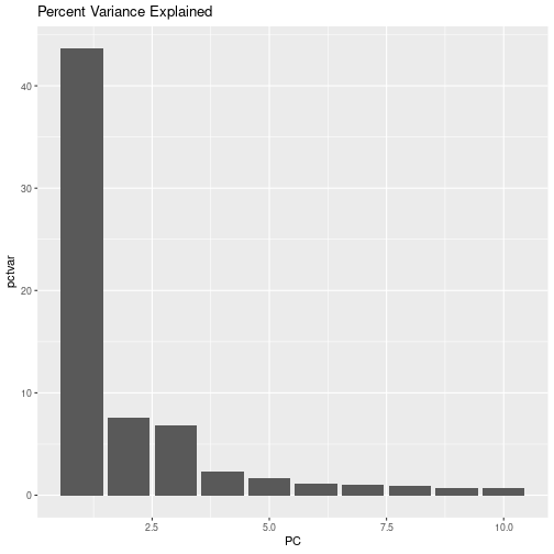 So, we have collapsed the majority of the variation in our 36,900 SNPs into 3 PCs!
Let’s pull out the PCs into their own tibble:
PCs <- as_tibble(geno.pca$x) %>% # the principal components
  mutate(ID=data.geno.10000$ID) %>%
  select(ID, everything())
head(PCs)
## # A tibble: 6 × 11
##   ID        PC1    PC2    PC3    PC4    PC5     PC6     PC7     PC8     PC9  PC10
##   <chr>   <dbl>  <dbl>  <dbl>  <dbl>  <dbl>   <dbl>   <dbl>   <dbl>   <dbl> <dbl>
## 1 NSFTV1 -31.8   -3.68  19.6  -0.860  0.672  -0.101   0.224 -0.0914   0.157 -2.05
## 2 NSFTV3  46.7   19.3    5.22  0.987 -4.06  -13.8     4.58  -1.03     1.39  -1.59
## 3 NSFTV4  36.6  -21.1   -4.45 -6.83   0.212  -5.02  -12.9    6.24   -17.3   -2.95
## 4 NSFTV5  -5.28  -7.60  -4.68 40.5   -2.19    0.958  -1.21   4.42    -0.160  1.21
## 5 NSFTV6  34.9  -20.9   -4.64 -6.51   1.40   -6.34  -14.9    7.13   -19.1   -3.85
## 6 NSFTV7 -19.2    3.86 -17.9  -0.931 -0.721   0.136  -0.390  0.739   -1.73   2.46
Exercise 3: Make 2 scatter plots, the first of PC1 vs PC2, and second PC2 vs PC3 (keep PC2 on the y-axis for both plots). Is there any evidence for populations structure (different sub populations)? If so, how many sub populations do you think the PCA plot reveals? What do you make of the individuals that are between the major groups?
Alternative: MDS
OPTIONAL If you are curious about how this would compare to an MDS analysis, you can compute the MDS as follows:
#calculate the Euclidian distance between each rice variety
genDist <- as.matrix(dist(geno.numeric))

#perform the multi-dimensional scaling
geno.mds <- as_tibble(cmdscale(genDist))

#Add the variety ID back into this
geno.mds$ID <- data.geno.10000$ID
head(geno.mds) #now we have 2 dimensions + the ID
geno.mds contains the genotypic information rescaled to display in two dimensions. Now lets plot it. Make a x-y scatter plot of the data, with “V1” on one axis and “V2” on the other axis.
END OF OPTIONAL SECTION
Adding phenotypes
The file “RiceDiversity.44K.MSU6.Phenotypes.csv” contains information about the country of origin and phenotypes of most of these varieties.
We are going to need to combine the data in the phenotype file with the genotype PCA data. In the tidyverse this is known as joining two data frames.
Please learn about joins by working through my join tutorial
EXERCISE 4:
- Use the
read_csv()head()andsummary()(orskim()in the skimr package …look it up) functions that you learned earlier to import and look at this file. Import the file into an object called “data.pheno”. - Use a
joinfunction to merge the PC genotype data (in the objectPCs) with the phenotype data into a new object calleddata.pheno.pca. Use summary and head to look at the new object and make sure that it is as you expect. - It (
data.pheno.pca) should have 413 rows and 49 columns. - Include your code in the .Rmd
## Rows: 413 Columns: 39
## ── Column specification ─────────────────────────────────────────────────────────────────────────────────
## Delimiter: ","
## chr  (6): NSFTVID, Accession_Name, Country_of_Origin, Region, Seed color, Pericarp color
## dbl (33): Alu.Tol, Flowering time at Arkansas, Flowering time at Faridpur, Flowering time at Aberdeen...
##
## ℹ Use `spec()` to retrieve the full column specification for this data.
## ℹ Specify the column types or set `show_col_types = FALSE` to quiet this message.
We can now color points on our PCA plot by characteristics in this data set.
EXERCISE 5: Prepare three different PCA plots to explore if subgroups vary by 1) Amylose content; 2) Pericarp color; 3) Region. That is make a scatter plot of PC1 vs PC2 and color the points by the above characteristics. Do any of these seem to be associated with the different population groups? Briefly discuss. (optionally repeat the plots plotting PC2 vs PC3)
Hint 1 to refer to column names that contain spaces in the name you can surround the name with backticks.
Hint 2 use color= argument ggplot to color the point by the different traits
Hint 3 when plotting the Amylose data, try add the following in your ggplot code: + scale_color_viridis_c(). For the Pericarp and Region data, try + scale_color_viridis_d() This specifies an opimized set of colors is used. (Try plotting with and without this). Note the c and d at the end of those functions are to specify __c__ontinuous or __d__iscrete colors.
Assign populations with Admixture
From the PCA plot it looks like there is structure in our population. But how do we know which individual belongs in which population? We can take an alternative approach and assign individuals to specific population classes with admixture.
We have to create two files in order to run fastStructure
.ped file
First we have to convert our genotypes to the form that admixture expects. Admixture wants a separate column for each allele, the sample ID in the second column and 4 more columns before the genotypes. Also, the genotypes need to be converted to 1s and 2s. The contents of columns 1 and 3-6 can be filled with zeros for this data set. A couple of the commands below are a bit complex. I can explain them in lab or discussion if desired. OK to CUT and PASTE.
data.geno.10000.admix <- data.geno.10000 %>%
  pivot_longer(-ID) %>%
  mutate(value = str_replace_na(value, "00")) %>% # next command won't work with NAs
  separate_longer_position(value, width=1) %>% # separate each genotype into two aleles
  mutate(value = ifelse(value==0, NA, value)) %>%
  group_by(name) %>%
  mutate(value=as.numeric(as.factor(value))) %>% # convert to numeric
  group_by(ID, name) %>%
  mutate(allele=c("a1", "a2")) %>%
  ungroup() %>%

  ## next commands arrange in order of chromosome, position
  separate_wider_delim(name, "_", names=c("chr", "pos"), cols_remove=FALSE ) %>%
  mutate(across(c(chr, pos), as.numeric)) %>%
  arrange(chr, pos) %>%
  select(-chr, -pos) %>%
  pivot_wider(names_from=c(name, allele), values_from = value) %>%
  mutate(across(-ID, ~ str_replace_na(., "0")))

# Add the extra columns
data.geno.10000.admix <- data.geno.10000.admix %>%  mutate(col1=0, col2=0, col3=0, col4=0, col5=0) %>%
  select(col1, ID, col2, col3, col4, col5, everything())

head(data.geno.10000.admix)

#write it out
write_delim(data.geno.10000.admix, file="../output/rice.data.admix.ped" , col_names = FALSE)
Create the map file. The map file describes the location of each SNP.
map <- tibble(SNP_ID=colnames(data.geno.10000.admix)[-1:-6]) %>%
  separate_wider_delim(SNP_ID, delim="_", names = c("chr", "pos", "allele"), cols_remove = FALSE) %>%
  mutate(SNP_ID = str_remove(SNP_ID, "_a[12]$"),
         cm = 0) %>%
  filter(!duplicated(SNP_ID)) %>%
  select(chr, SNP_ID, cm, pos )

head(map)
## # A tibble: 6 × 4
##   chr   SNP_ID      cm pos
##   <chr> <chr>    <dbl> <chr>
## 1 1     1_172755     0 172755
## 2 1     1_173692     0 173692
## 3 1     1_203126     0 203126
## 4 1     1_205867     0 205867
## 5 1     1_263568     0 263568
## 6 1     1_266818     0 266818
write_tsv(map, "../output/rice.data.admix.map", col_names = FALSE)
Run Admixture
Now we can run admixture. admixture will determine the proportion of each individual’s genome that came from one of K ancestral populations.
admixture is run from the Linux command line.
cd ../output
admixture rice.data.admix.ped 4 #The 4 specifies that we hypothesize 4 ancestral populations
In the above command, 4 specifies the number of ancestral populations that admixture should create.
Load the fastStructure results
The file rice.data.admix.4.Q contains 1 row for each sample, and 1 column for each ancestral population. The numbers give the proportion of the genome inferred to have come from the ancestral population.
Back in R:
adm_results <- read_delim("../output/rice.data.admix.4.Q", col_names = FALSE, col_types = 'nnnn')
head(adm_results)
Now lets add sample IDs back and give our populations names.
adm_results <- adm_results %>%
  mutate(ID=data.geno.10000$ID) %>%
  select(ID, pop1=X1, pop2=X2, pop3=X3, pop4=X4)
head(adm_results)
## # A tibble: 6 × 5
##   ID         pop1    pop2    pop3    pop4
##   <chr>     <dbl>   <dbl>   <dbl>   <dbl>
## 1 NSFTV1 0.00001  0.00001 0.00001 1.00
## 2 NSFTV3 0.000014 1.00    0.00001 0.00001
## 3 NSFTV4 0.856    0.144   0.00001 0.00001
## 4 NSFTV5 0.00001  0.00001 1.00    0.00001
## 5 NSFTV6 0.862    0.133   0.00001 0.00476
## 6 NSFTV7 0.0281   0.0467  0.0428  0.882
In the adm_results table, each row is an individual and each column represents one of the hypothesized populations.
Genomes with substantial contributions from two ancestral genomes are said to be admixed.
Let’s use these proportions to assign each individual to a particular population. The code below assigns an individual to a population based on whichever ancestral genome has the highest proportion. Of course this can be somewhat problematic for heavily admixed individuals.
adm_results$assignedPop <- apply(adm_results[,-1], 1, which.max)
head(adm_results)
If you want to know how many individuals were assigned to each population, you can use table().
table(adm_results$assignedPop)
The admixture output must be reformatted in order to plot it well. Not all of the commands are fully explained below. If you have questions we can go over this in Friday’s discussion.
For plotting it will be helpful to order the samples based on population identity and composition. To do this, let’s make a new column that has the maximum proportion for each sample and then rank them accordingly.
adm_results$maxPr <- apply(adm_results[,2:5],1,max)
adm_results <- adm_results %>%
  arrange(assignedPop,desc(maxPr)) %>%
  mutate(plot.order=row_number())
Reshaping data.
Spreadsheet data is often organized in a “wide” format where there is one row per individual and then multiple traits measured on that individual are in separate columns. This is a convenient format for data entry, but R often wants data in a “long” format with one observation per row. For example, the admixture data is in wide format but we need it in long format. Please work through my Pivot tutorial to learn more about these formats and how to convert.
adm_results_long <- adm_results %>% pivot_longer(pop1:pop4,
                                               names_to="population",
                                               values_to="proportion")
head(adm_results_long)
## # A tibble: 6 × 6
##   ID      assignedPop maxPr plot.order population proportion
##   <chr>         <int> <dbl>      <int> <chr>           <dbl>
## 1 NSFTV13           1  1.00          1 pop1          1.00
## 2 NSFTV13           1  1.00          1 pop2          0.00001
## 3 NSFTV13           1  1.00          1 pop3          0.00001
## 4 NSFTV13           1  1.00          1 pop4          0.00001
## 5 NSFTV44           1  1.00          2 pop1          1.00
## 6 NSFTV44           1  1.00          2 pop2          0.00001
Finally we are ready to plot the results. In the plot produced below, each column is a single rice variety. The colors correspond to ancestral genomes. Do you see any evidence of admixture?
adm_results_long %>%
  ggplot(aes(x=plot.order, y=proportion, color=population, fill=population)) +
  geom_col()  +
  ylab("genome proportion") +
  scale_color_brewer(type="div") + scale_fill_brewer(type="div")
How do these population assignments relate to the PCA plot?
EXERCISE 6: First, use a join function to combine the PCA data (in object PCs) with the population assignments (in adm_results) and place the result in geno.pca.pop. Then re-plot the PCA data, but use the population assignment to color the points. Make one plot for PC1 vs PC2 and a second for PC3 vs PC2. How do the populations assignments relate to the PCA plots?
Hint convert the assignedPop variable to a character type before starting, with:
adm_results <- adm_results %>% mutate(assignedPop=as.character(assignedPop))
We will use some of the objects that you have created today in next week’s lab, so lets save them in an .Rdata file for easy loading on next week.
save(data.pheno,geno.pca, PCs, geno.pca.pop,adm_results,file="../output/data_from_SNP_lab.Rdata")
Tutorial Downloads
NOT NEEDED UNLESS TUTORIAL LINK ISN’T WORKING
If the Maloof Lab webserver isn’t working, then you can download the various tutorials from github and run them locally:
Download:
devtools::install_github("UCDBIS180L/BIS180LTutorials") # only needs to be done once
ggplot:
learnr::run_tutorial("ggplot", package = "BIS180LTutorials")
Joins:
learnr::run_tutorial("Joins", package = "BIS180LTutorials")
Pivot:
learnr::run_tutorial("Pivot", package = "BIS180LTutorials")